5.02.2007

Additional exercises


Two different kind of newspapers, compare rhe use of the color, the use of the white and the difference of the layouts. One of them is from Europe, the other one is from South America


The Front Page of the Newspaper

We are going to start creating the front page of our own newspaper.
A little advice from the book Pure Design by Mario GarcĂ­a. (Miller Media, Florida 2002):


3.28.2007

Photoshop: Feather, simple collage w/feather


You can select images with a feather and create simple collages, copying and pasting the images with feather as a disolvence, using different layers.
You can use the Eraser tool (E) with different brushes and Master Diameters to create simple effects on the edges of the picture.
The Eraser tool has different kind of brushes. Try to use a simple brush, not a fancy one, (unless you need it and you can justify its use). As the filters, these should be used just ot create little details, not to ABUSE of them.
If you are using the Type tool for your final work, don't mix more than 3 fonts in the same page. (And it is better if you just use ONE FONT with its own varieties: Bold, Semibold, Regular, Italic, etc)

EXERCISE THE BRONX JOURNAL TV AD

Full page
color: CMYK,
Size: 10" W x 14" H
Save it as an Illustrator eps. doc. or a Photoshop TIFF

Half page
Size: 10"W x 7" H
Color: CMYK
Save it as an Illustrator eps document or as a Photoshop TIFF.

1/4 page
Size: 5"W x 7" H
Color: CMYK
Save it as an Illustrator eps document or as a Photoshop TIFF.

Photoshop: Paste Into, Strokes


Filling text with pictures
Using the Paste Into option

Photoshop
Create a New Document

Photoshop>File>New
SIZE: 12 inches width/3 inches height/ White Background/ RGB
Select the Type Tool

Type YOUR NAME (Size: Between 110-120 points)
Font: Gill Sans Bold

Select up to three (3) pictures form the web. High Quality. (You can use the tool Google Images>Large Images)

1. You copy the picture that you want to past into the Text
(If it is the whole picture you just use the Apple+A and then, Apple + C (Copy) )
2.Select the letter or letters that you want to fill. Because they have the same color you can use the Wand tool
3. Paste the picture INTO the letters (Photoshop>Edit>Paste Into)
4.You can modify the size of the picture,s the colors, you can apply filters according to your creativity.
5. Give the letters a stroke 10 px. (any color) Photoshop>Edit>Stroke>
5.Flatten Image (Photoshop>Layer>Flatten Image)
6.Crop any excessive background (Crop tool)
6.Save as jpg.
7.Upload the image to your blog

3.21.2007

TBJ TV LOGO

EXERCISE/REAL CASE/CREATIVITY TBJ TV logo

Use these elements (you can download others from the web, not more than 2), to create an Illustator logo for the program TBJ TV. The logo must be a 4 colors (CMYK) Illustrator eps document.


3.14.2007

Final list of blogs. MLJ Spring 2007 class

Vivian

www.vivsblogspace.blogspot.com


Shadora
www.shadoraswilkes.blogspot.com

Aisha
www.aal-muslim.blogspot.com

Elizabeth
www.eda1805.blogspot.com

Alvin
www.alisojo.blogspot.com

Sasha
www.sashamejia.blogspot.com/

Daneth
www.danetsamreth.blogspot.com

Octavia
www.octaviaprime.blogspot.com

Gregory
www.gnelsonbloggs.blogspot.com

Cover "Mondo Pen Magazine", Exercise March 14

Another picture for exercise -magazine cover, march 14


Pen feather picture used to create the Illustrator logo.
-Create a path (you can do a selection with the Wand Tool and then choose Select Inverse, create the path, save it, copy the image and paste it as fully editable on a new Illustrator document)
-Use the pen feather and the words Mondo Pen to create the logo of the magazine.

pictures for exercise cover, march 14


Title: Arundhati Roy
Deck (smaller): The Small Gods of

CREATE THE COVER OF A MAGAZINE, MARCH 14


Create the logo using Illustrator
I used Baskerville font (Semibold)
Approx, size: 122.17
Horizontal scale:91.57%
Color: Y100, M17.

Sample. Using Pen Tool to create a logo


Here are the three (basic) steps to create a logo using the Pen Tool of Photoshop and Illustrator's Pathfinder.
The original picture is on top: a horse

We create a path using the pen tool
Save the path
Copy the picture and paste it on a new Illustrator document as fully editable.
Use the degrade tool to fill the background of th semicircle
Substact the shape of the horse
Add the font with the name of the company: White Horse

3.07.2007

First newsletter exercise


You are going to create the logo for the newsletter using some of the exercises of today's class. For the other stories of the newsletter's front page, use your own images form past exercises.
NEWsletter Size: 8.5 inches x 11 inches (US Letter)

To upload the newsletter from Quark, first you have to export it as a pdf (File>Export>PDF). Then open the pdf from Photoshp. Save it as a jpg. Dont forget to transform it to RGB.

Tips

F7 > To view the Guides
Ctrol + 0 To fit in window
Ctrol + B To create frames for your Boxes (Item>Frame)
Ctrol + T To create roundaraound (Item>Roundaround)

Review Illustrator

2.28.2007

Create your own Business Card and a Postcard

Create a business card with your logo.
LOGO, create a logo and present it inside an A4 illustrator document. White background
Post it on your blog. 3 to 5 lines describing how you created your logo, the tools you have used, etc.


BUSINESS CARD
Size of the business card:
3.5" x 2"

1*using a picture as background. (Could be your picture) with your logo
2*using a logo over white
3*using a color logo over another color as a background

Information, Name of the company (could be part of the logo). Position in the company, e-mail address

Size of the postcard
4" x 6"

1) Spring in the Bronx. Any picture as a background (use duotones and color mixed)
2)Mother's day Use Photoshop>Filter>(Artisitic or Blur or Sketch or Brush Strokes, etc..)
Over the postcard create a 3 words phrase, do it using Illustrator, change the colors, the strokes, use the pathfinder tool)
3)Post it on your blog

Quark Xpress Basic Windows

2.14.2007

ILLUSTRATOR TOOLS


PHOTOSHOP EXERCISE (black and white)


Use the Photoshop tools to paint Barts Simpson, try to make it as similar as possible to the original:


Creating a logo using Illustrator (Exercise ONE)

EXERCISE 2 Creating a LOGO using Illustrator


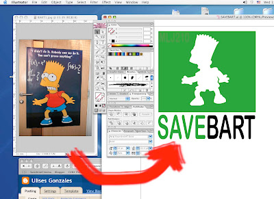
You can see here in the picture above, how starting from an image in pixels (Bart poster) you are able to create a logo in Illustator, using Bart silhouette.

BASICS:
I am working in a New Illustrator document A4 (Apple +N)
The size of the green rectangle is 6 inches W and 5 inches H (Illustrator>Window>Tool>Rectangle)
The color of the green rectangle is 85% C, 100% Y (Illustrator>Window>Color ) or F6
The font of the logo is Arial Rounded MT bold (Illustrator>Type>Font)

STEPS:
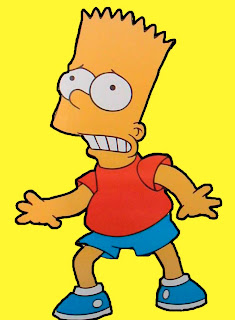
1.Open FROM PHOTOSHOP the BART2image here at the end of the post.
2. Select the yellow background with the MAGIC WAND TOOL (Photoshop>Windows>Tools)
3.Select Inverse to select Bart's silhouette (Photoshop>Select>Inverse)
4.Create a path: Photoshop>Window>Path>Make work path from slection
6.Name the path: Photoshop>window>Path>(Name the path: BART)
7.Copy the selection (Photoshop>Edit>Copy)

8.Open a New Illustrator document (Ilistrator>File>New> (A4 size, any orientation)
9.Paste the Photoshop document (Illustrator>Edit>Paste)
-A window is going to open , Paste as> Compound Path (Fully Editable)
-Create a green rectangle (5in H, 6 in. W) Illustrator>Tools>Rectangle. Click on the document and a window is going to show up and you give the size of the rectange ( 6in. W, 5 in. H) and the color C:85 Y:100 (From the Illustrator color pixer)
-Reduce the size of the Bart path to fit inside the green rectangle, and color it with White color inside and No shape
-Write the slogan SAVE BART using the font Arial Rounded MT bold (Illustrator>Type>Font) You can make it bigger or samller to make it similar to the logo above.

2.07.2007

EXERCISE COLORS USING PHOTOSHOP


Use the bucket and gradient tool, the color picker and the foreground color and blackground color to paint this picture.
Save it in a different layer and create a background using a gradient.

EXERCISE PHOTOSHOP SOFIA COPPOLA


EXERCISE 2

1.Clean the picture using the clone stamp tool
2.Select the eyes and the lips of the picture and change the color of them using the selection tools and the Adjustment>levels, Adjustment>Curves tools. Save your picture as a RGB document
3. change the picture to grayscale and change the color to duotone. Save the document as a duotone picture (Change to RGB to post it on the blog)
4.Crop the color picture. You need just 25% of it. Save it as RGB Print it and justify to the class why you are using that part of the picture.
5. Think about using this picture with a bif logo on it, as a cover of a magazine. (Just think about it! and try to look at other magazines in your way home or in your way to Lehman everyday)

PHOTOSHOP TOOLS


Different kind of tools in Photoshop: Selection tools, lasso, Magic wand, Selection Path, Clone Stamp, Buck, Gradient, Eraser, Type, Eyedropper, Brush and Pencil Tool, Dodge, Sponge, Zoom, Background color, Foreground color, Color Picker.

Create a new document (Apple + N)

Resolution: 300 dpi is High Resolution (lowest the resolution, lowest the quality. A good resolution for the blog should be 180 dpi. The bigger the document, the heavier.

Color Mode: Image> Mode ---CMYK (print) RGB (web and blog)----

Save as: jpeg (compress), TIFF (always when working for a layout in Quark), Photoshop (if you want to conserve the layers)

Flatten image (Layer>Flatten image)

Filter (there are some effects that you have to be in a document as RGB to use)

Adjustment Color: Adjustment> Levels> Curves